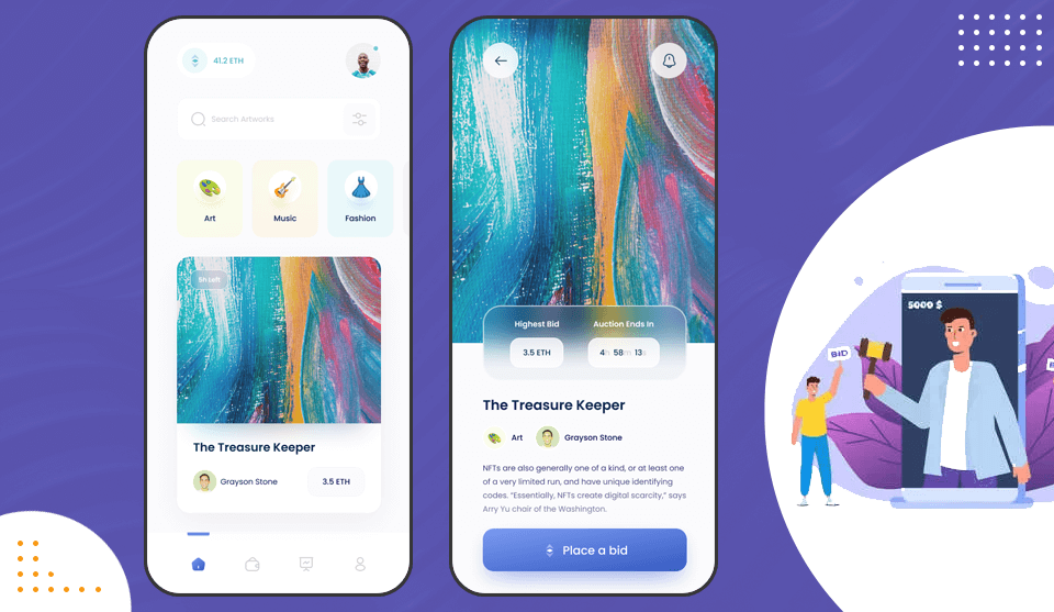
“First Impression is the last impression” the saying is well suited when it comes to representing a business website. A website is the face of any business and if the face is unresponsive or uninviting then who is going to dig into the massive orientation of that business. And in the era where 80% of smartphone users have internet in their phones, the need to have a responsive mobile website is indispensable for any business.
The mobile website that is just well-managed, well oriented, informative and quick to load is the preferred choice by any client as well as Google and is ultimately the need of the day for running a business.
Here are some tips you can’t ignore if you are looking forward to creating a responsive mobile website:
Tabs should be finger-accessed
The important tabs on the mobile website should be made keeping in mind the convenience of the user. The CTAs should be made thumb accessed so that the visitor visiting your site is able to use it with a single hand accessing the important tabs with the thumb. As per statistics from Human Fingertips to Investigate the Mechanics of Tactile Sense each button is a touch target and should be 45-57 pixels wide so that the user can comfortably reach the tabs with a single hand.
Font and colors matter
Simplicity is a new trend. A mobile website should be kept simple with less fancy fonts or colors. Keeping in mind the size of a mobile screen, it is highly suggested to use taller fonts and give a little extra space between the fonts allowing easy readability. Font styles could be Helvetica, Times New Roman, Georgia, Arial, Coral, etc. It is further suggested to use the monochromatic color palette going in line with the color scheme of the brand image.
Interface to guide Newcomers
Newcomers should always be guided with tutorials related to the functionality and benefits of the website. Something like a new user guide can be introduced for them to easily get familiar with the functionality and features of the website. Whether it is a laptop, PC or smartphone a new user should not feel lost, distracted or frustrated while using your website. Guide them well through a well-structured menu bar, well-outlined images, search tabs, etc. Add a ‘skip intro’ facility for those who do not require website tutorials.
Easy Navigation Rule
Users should be able to get what he wants from your website without hassling with the tabs or pages. Adopt a three-click policy. Try to showcase the informative content of your website in just three clicks by the user. The mobile user can easily switch to other options if they have to cross a number of pages to acquire the information. Try to confine the contents, sub-contents, categories and other navigation levels.
Having a Search Bar
It is difficult to display the website exactly the same way as it is showcased on a laptop or PC. In a smartphone, size changes, and with that, the design of the website also changes. In order to incorporate all the categories, the mobile website designers construct the hierarchical structures which can make it difficult for the user to attain information. A search bar on the first page will solve this problem to an extent. The search bar cuts down the need to navigate giving the user a much more friendly user interface.
A website represents a business. It is for sure that the existing user will remain engaged and also new will land on your website to seek information if the above-mentioned criteria are fulfilled.
Need a hand with the customization or development of a mobile-friendly business website? Hire SAG IPL – a professional mobile web development company in India.


Leave a Reply