User Interface or UI in information technology is designed as an information device that allows interaction between the device itself and the person. This includes screens or touchscreens, keyboards, or a mouse. Aside from that, UI also allows user interaction through websites or mobile applications. Many companies today are growing more and more dependent on applications; hence, the need to utilize UI to elevate user experience.
On the other hand, conceptual animation is a type of concept art wherein an idea is converted into motion design before it’s made into a real product. Do you ever wonder how some yet-to-build establishments already have posters, videos, or pictures of how it’s going to look like? That’s conceptual animation. It’s the process of initially designing a blueprint with the help of technology. Motion designs typically vary in tools like Adobe After Effects, Figma, and InVision. These tools are used to make most motion design concepts nowadays. However, how is it important to integrate UIs and conceptual animations?
You see, there have been so many changes in the web design industry lately, particularly web design in the Philippines. Constant developments and innovations are here and there that companies are having a hard time keeping up. However, these changes bring nothing but positive impacts on different industries nowadays, especially one that involves real estate, interior, and architectural design, furniture, and a lot more. In this article, you will learn more about the benefits or the reasons why it’s the best decision for your company to integrate UI with conceptual animations.
More Convenient
Incorporating UIs and conceptual animations together can bring so much convenience to users all over the world. For example, if you’re an architect, instead of traditionally using pen or pencil and paper, you can work your way out through either your mobile phone, a tablet, or your desktop computer. You don’t have to fear or worry about lost designs, because you can directly store everything up on a hard drive, a cloud, or send it through e-mail.
Convenience is right at the tip of your finger. You can access it anywhere and anytime you want to. Also, instead of manually looking or searching for something, UIs and conceptual animations formed together can quickly help you locate particular things through any device. A search bar, your messages, navigation, and so much more. Conceptual animations generally have ready-made solutions to user problems and a series of different but effective technical approaches.
It Stands Out
If you want your business to establish an online presence and stand out from all companies within the same industry, then you should combine UIs and conceptual animations. The real catch here is that it gives your website or application a different feel or vibe that users would want to stay or keep coming back for more. In a crowd full of plain and simple web and app designs that almost look like clones, be the one that stands out.
You might be wondering, how will this design stand out from all other designs and animations? Well, here are a few examples of UI conceptual animation designs:
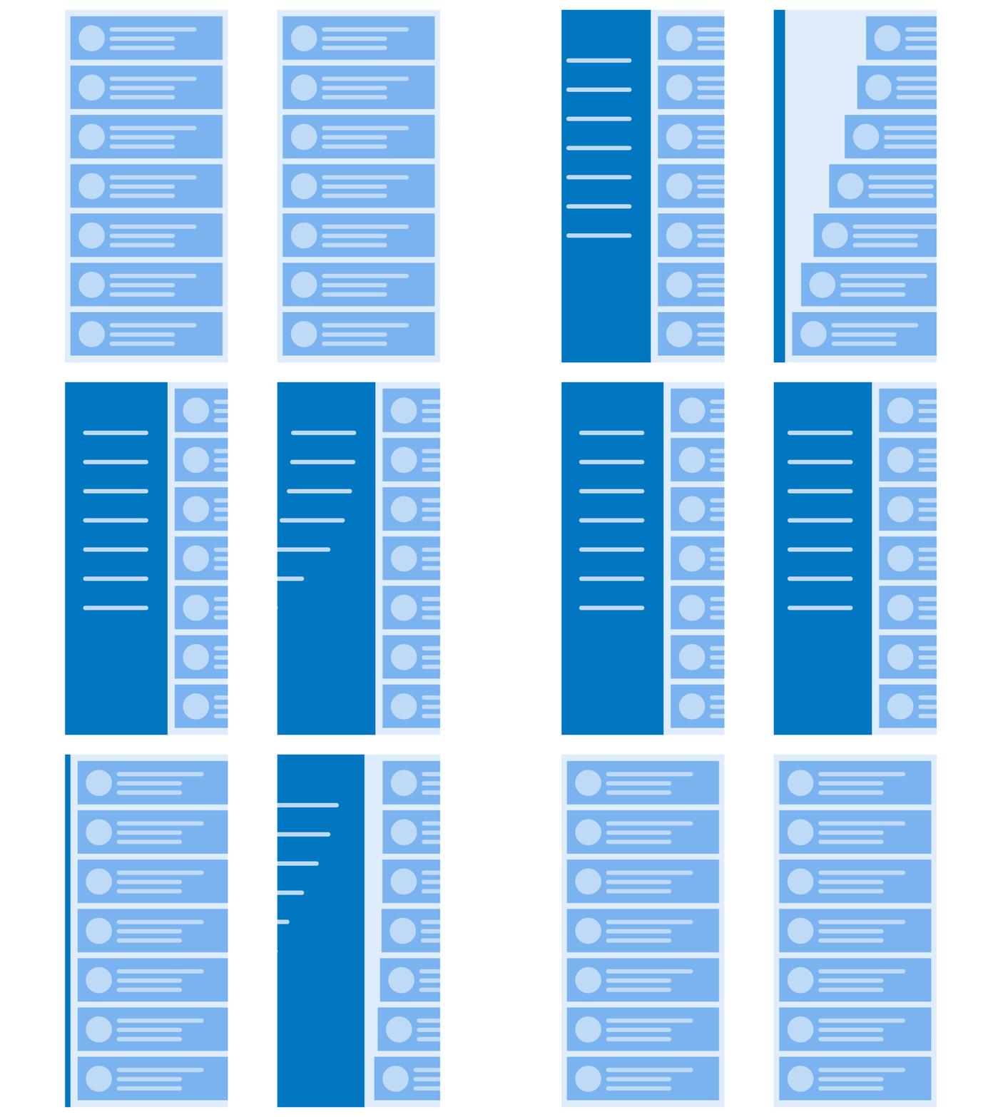
- Opening Side Menu – This basic operation can be modified and enhanced into something much more appealing to all users. Instead of a lifeless side menu, UI concept animations can turn this into an elegant navigation with a continuous flow featuring all objects instead of it looking so stiff and “systematized.”

GIF source: Tubik Blog
- Scrolling or Navigating Through a List of Items – again, instead of a plain and simple way of scrolling through items, probably like emails or messages, UI concept animations make it look a bit livelier than usual. The animation on the right makes it look like you’re pulling out cards of information from below, while the one on the left is just a simple way of scrolling through the items.

GIF source: Tubik Blog
Provides Visual Feedback
UI concept animations can also provide users with visual feedback, should you need to inform them about certain outcomes of different situations, navigations, or processes. In this case, when an operation is not successful, the characters tend to toggle or shake, imitating a universal gesture of shaking your head “no.”

GIF source: The Kinetic UI

GIF source: The Kinetic UI
Meanwhile, in this case, the animation imitates another universal gesture, which is a nod, upon successfully entering a password.
Wrapping Up
All in all, incorporating UIs and conceptual animations together bring lots of positive impact on both users and businesses today. Living in a world where almost everything is synchronized, flat, and dull, the animation is one of the best ways to make websites, pages, and applications stand out from the rest of the competition. It’s time to stop looking like clones and start distinguishing yourself as unique and innovative.

Author’s Bio:
Edwin Deponte is a motivational writer who is also passionate about Social Marketing. He believes in others’ abilities and tends to bring out people’s hidden potentials through his words of inspiration and motivational articles.


Leave a Reply